Icons are the silent communicators of the digital world. They direct, alert, engage, and inform without saying a word. Among them, the mail icon stan
Icons are the silent communicators of the digital world. They direct, alert, engage, and inform without saying a word. Among them, the mail icon stands out as one of the most universal symbols. From the early days of email to today’s richly designed user interfaces, the mail aesthetic icon has transformed from a simple envelope into a design element full of personality and purpose.
In this article, we dive deep into the design philosophy behind mail aesthetic icons—how they function, why aesthetics matter, and what trends are shaping their appearance today.
What is a Mail Aesthetic Icon?
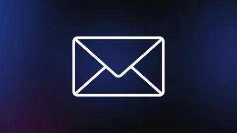
At its core, a mail icon is a visual representation of email or messaging. It’s most often displayed as an envelope or paper plane, indicating communication. But when we talk about a mail aesthetic icon, we’re referring to a version that has been thoughtfully crafted with style, character, and design principles.
This kind of icon doesn’t just serve a purpose; it also adds to the visual narrative of an app or website. It might be soft and subtle in a wellness app, or bold and animated in a tech-forward email client. The icon reflects not only the app’s functionality but its voice and tone as well.
Why Design Matters in Icons
Icons might be small, but their impact is massive. Here’s why visual design is crucial:
1. First Impressions Count
An app icon is often the first visual touchpoint a user has with a brand. A visually appealing mail icon can capture attention, evoke trust, and give users a hint of what to expect.
2. Enhances Usability
An aesthetically pleasing icon also needs to be understandable. If an icon is too abstract, users might not grasp its purpose. A well-designed mail icon finds the balance between creativity and clarity.
3. Supports Brand Identity
An icon aligned with a brand’s colors, style, and tone strengthens consistency across a product’s interface.
4. Builds Emotional Connections
Aesthetic icons can create delight and emotional resonance. Whether it’s nostalgia from a vintage letter design or joy from a soft color palette, they make user experiences more human.
Historical Evolution of the Mail Icon
Understanding how the mail icon evolved helps highlight its growing aesthetic value.
Early Interfaces (1990s–2000s)
The first mail icons were utilitarian. Basic grayscale envelopes were used in operating systems and early webmail platforms. A focus on clarity and simplicity made sense, as users were new to digital communication.

Rise of Smartphones (2010s)
As mobile apps emerged, designers began experimenting with color, gradients, and shadows. App icons, including mail apps like Gmail and Outlook, needed to stand out in a crowded field of icons on home screens.
Flat Design and Material Design (Mid 2010s)
Aesthetic took a turn toward minimalism. Icons became flat, vector-based, and focused on simplicity and clarity. This era made icons cleaner, lighter, and more modern-looking.
The Custom Design Movement (2020s–Present)
Now, users expect design to be beautiful as well as functional. With customizable UIs and personalization on the rise, the demand for aesthetic, artistic icons—including mail icons—has never been higher.
Common Styles of Aesthetic Mail Icons
Different visual styles appeal to different users. Let’s explore the popular ones:
1. Minimal and Flat Icons
These icons use basic shapes and monochrome or limited color palettes. Ideal for corporate or productivity-focused interfaces.
2. 3D and Skeuomorphic Icons
Icons in this style often resemble real-life envelopes, complete with shadows, textures, and depth. They add realism and a nostalgic charm.
3. Hand-Drawn/Doodle Icons
Perfect for creative platforms or personal websites, hand-drawn icons give a playful, human feel.
4. Pastel and Soft UI Icons
With soft gradients, rounded edges, and soothing tones, these icons are prevalent in wellness, education, or journaling apps.
5. Dark Mode/Neon Icons
High-contrast, glowing icons for dark-themed UIs, often seen in modern, tech-forward applications.
Design Elements That Make a Mail Icon Aesthetic
To elevate a standard icon into an aesthetic one, designers focus on several elements:
1. Color Harmony
The choice of color defines the mood. Cool tones offer calmness, while vibrant colors convey urgency or activity.
2. Simplicity
Even with decorative details, the icon should be instantly recognizable. Overdesigning can confuse users.
3. Scalability
An icon should look good at all sizes—from notification badges to large web headers.
4. Consistency
A mail icon should feel like part of the broader UI design, matching the theme, palette, and style.
5. Animation
Modern UI sometimes includes micro-interactions. A tiny mail icon could shake slightly when a new message arrives or show a subtle glow to prompt action.
Where Aesthetic Mail Icons Are Used
You’ll find these icons in various digital environments:
- Mobile and Web Email Clients: Apps like Spark, ProtonMail, and Apple Mail often redesign their mail icons to match modern UI trends.
- Messaging Platforms: Many apps use envelope symbols to represent private messages or inboxes.
- Notification Systems: Aesthetic mail icons with counters are commonly seen in UI dashboards or admin panels.
- Contact Sections on Websites: Designers often use elegant or themed mail icons to indicate contact options.
- Custom Mobile Themes and Launchers: Android users especially love customizing their app icons, including mail apps, to match seasonal, aesthetic, or thematic wallpapers.
Designing Your Own Aesthetic Mail Icon
Whether you’re a UI/UX designer or just a creative enthusiast, crafting your own aesthetic mail icon can be a rewarding process.
Step 1: Choose a Style
Decide if your icon should be minimalist, playful, retro, futuristic, etc. This depends on your audience and the product it serves.
Step 2: Select a Design Tool
Popular tools include Figma, Adobe Illustrator, Canva, Procreate (for hand-drawn), and Sketch.
Step 3: Build a Color Palette
Use color theory to create balance. Pastels, monochromes, or bold contrasts all serve different purposes.
Step 4: Sketch and Iterate
Start with rough drafts. Refine the design to ensure clarity and appeal.
Step 5: Test in Context
Always preview your icon in real scenarios: dark/light mode, different screen sizes, or even animated states.
The Role of Icon Packs and UI Kits
Many designers turn to pre-made icon packs for consistency and speed. These packs often include aesthetic mail icons that follow a shared visual language. Whether designing a blog or an entire app, using cohesive icons elevates the entire interface.
Custom UI kits may feature variations of mail icons:
- Envelope with a paper
- Envelope with a heart or star
- Envelope with wings
- Opened or closed mail
- Mail with a number badge
These variations allow designers to communicate different states like new mail, favorite mail, or urgent messages.
FAQs: Mail Aesthetic Icon
Q1: What does an aesthetic mail icon typically look like?
An aesthetic mail icon often includes an envelope or letter with stylized details such as soft colors, rounded edges, shadows, or hand-drawn lines. It blends functionality with beauty, making it visually appealing while remaining recognizable.
Q2: Where are mail aesthetic icons commonly used?
They’re used in email apps, messaging platforms, websites’ contact sections, mobile themes, desktop dashboards, and anywhere digital communication is involved.
Q3: Are aesthetic icons better than standard icons?
Not necessarily better, but they add visual value. Aesthetic icons enhance the user interface and can make digital interactions feel more thoughtful and engaging.
Q4: Can I animate my mail icon for better UX?
Yes. Micro-animations like envelope flaps opening or glowing badges can make your interface feel more dynamic. Just ensure it doesn’t distract or slow performance.
Q5: Do aesthetic icons affect accessibility?
Yes, they can. Icons should always be designed with contrast, scale, and clarity in mind. Adding alt text or labels improves accessibility, especially for visually impaired users.
Q6: Are there tools for generating aesthetic mail icons?
Yes. Tools like Figma, Canva, Iconfinder, and Flaticon allow you to design or customize mail icons. Some platforms offer aesthetic icon packs you can adapt for your own use.
Q7: How can I make sure my icon matches my brand?
Use your brand’s color palette, font-inspired shapes, and tone of voice to guide the design. A mail icon that reflects your identity makes your platform more consistent and memorable.
Conclusion
A mail aesthetic icon may be small in size, but its impact is large. It plays a crucial role in guiding users, representing communication, and shaping the visual identity of digital products. With thoughtful design, these icons go from being mere tools to becoming part of a brand’s storytelling.
As digital spaces continue to evolve, users will expect more personality, beauty, and clarity from every interface element—even something as simple as a mail icon.
More Must Visit: infromednation


COMMENTS